
This workshop was created for Women Who Code Connect Forward 2020
Setup Project
Let’s get started:
- Launch Xcode
- Choose “Create a new project” from the welcome screen
- Choose watchOS -> Watch App

- For Product Name enter “Tip Calculator” or whatever name you want
- We want to have SwiftUI selected for Interface
- SwiftUI selected for Life Cycle
- Swift selected for language
- Uncheck “Include Notification Scene”
- Organization Identifier usually domain name in reverse. I use com.thecoderpilot for mine

Save the project, I usually do the desktop for easy finding later.
Run the app to see how it looks on WatchOS 44mm
What are we adding
The first step is to decide what our app will look like. What do we want it to do and how we want the user to interact with it.
I have worked out a rough sketch of what I think will work for us today. You can always go in and change it afterwards to make it unique to you and your style.
We need the user to do two things.
- Enter the price
- Enter the tip percentage
Then we can give them the tip amount.
We don’t have much space to work with and we need to be able to interact with the small screen with our fingers. This is one of the challenges of working with the apple watch. But it helps us to keep our design simple and only use what we see as important.
First Screen
Let’s open up ContentView.swift so we can start setting up or design. Right now all it has is the Text(“ Hello World”) which is what we saw when we ran the app earlier.

The first thing we want our user to do is to enter the dollar amount of the meal.
The easiest way to get something on the screen is to have a text view for the amount and a slider that lets them control the amount and at the bottom of this a button to trigger the next step.
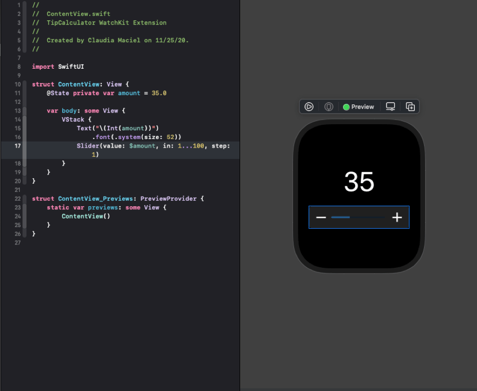
Let’s start with the text view with the meal amount. Let’s create a variable for our dollar amount. This is going to change over time so we need to store it in a @State property
@State private var amount = 35.0
Next we want to display that amount inside our body property like this:
 var body: some View {
    VStack {
       Text("\(amount)")
         .font(.system(size: 52))
       }
    }
52 is a nice size font that lets you see the number on the screen, without having to squint.
However when we do this you will see that the label reads 35.000000 and it wraps across two lines. SwiftUI will try to preserve the full accuracy of the value. That’s good for long calculations but for now we want only the dollar amount.

Let’s convert it to an Int so it looks as we want it to.
Text("\(Int(amount))")
That’s all we need for our label. Let’s move on to the next item in our stack.
The slider, which will let us adjust the dollar amount.
The slider will need to control the amount by reading it and also needs to write the value based on the feedback of the user.
SwiftUI uses what’s called as two-way bindings to do this use use $amount
So if we try to add the slider under the text xCode is going to do something unexpected. It’s going to give us 2 previews and we don’t want that we want it to be all together in one app.

This is because SwiftUI only wants to work with one View and one view only. If we are going to have more than one item on our screen we need to place our item inside of a Stack. It can be a horizontal Stack or a Vertical Stack in our case we wan to stack our items vertically. So we will put our Text and Slider inside of a VStack.
Now it looks like we expected it to.
I want to give you a quick disclaimer here: Using a Slider in this case is not the best option Using a number pad would be so much easier. However Apple does not make it easy to do so. For time sakes we will stick to using a slider for this.
Let’s run our project and see it in action. It’s all connected but it’s not too exciting yet. Let’s keep going.
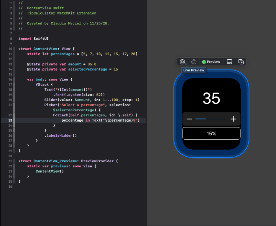
We need a way for the user to select the tip percentage that they would like to leave. We want the user to select a percentage from a list of options. A picker would be the best way to do it here.
Let’s add an array with different percentages
static let percentages = [5, 7, 10, 12, 15, 17, 20]
and we also need to add a variable to store our selected percentage.
@State private var selectedPercentage = 15
And now we add our Picker, our Picker needs a label. We added our two way binding to change the tipSelected
Inside the Picker we have a ForEach loop that loops over all the percentages. To create each item in the picker we put it inside a text view. We have to convert it to a string and add the % symbol.
We don’t wan the label to appear on screen so we will hide it.
Picker(“Tip percentage", selection: $selectedPercentage) {
   ForEach(Self.percentages, id: \.self) { percentage in
      Text(“\(percentage)%”)
   }
 }
 .labelsHidden()
Let’s run our app and see it all working. You will notice that when you select the picker you get a nice green border to let you know it’s the active component on the screen.
It’s working but it’s not looking very pretty so let’s make some UI changes.
We need to add a button that lets the user see the tip amount so let’s add that next to our Picker. This will make the items smaller and look better.
To put items side by side we need to put our picker in a Stack and we will add the button next to it.
Right now our button is just putting some text on the screen but we will change that in a bit.
 HStack {
    Picker("Select a percentage", selection: $selectedPercentage) {
       ForEach(Self.percentages, id: \.self) { percentage in
          Text(“\(percentage)%”)
      }
    }
    .labelsHidden()

   NavigationLink(destination: Text(“Tip Amount")) {
       Text("Tip")
    }
 }
Let’s run the app, we can change the dollar amount, pick a tip percentage and press the button to go to our next view.

Let’s clean up the layout and make it look nicer.
Let’s add a title to our screen
After the VStack let’s add
.navigationTitle(“Tip Calculator”)
That was simple enough.
The next change is to get rid of some of that space under the 35.
We will do this by removing the automatic spacing
VStack (spacing: 0) {
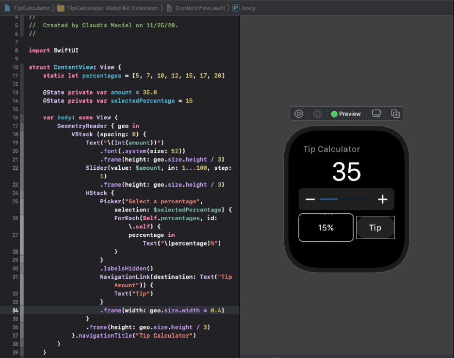
The next thing we want to change is to make sure that the three things on our screen take up the same amount of space. we want to divide the screen size by 3 and have each one be evenly spaced. This is simple enough with Geometry Reader.
We need to put all of our code inside of
GeometryReader { geo in
VStack …
Now we can use frames to set the height of our three items by adding the following modifier
.frame(height: geo.size.height / 3)
And we don’t want the button to take up half, we just want it to take up 40% of the space.
add
.frame(width: geo.size.width * 0.4)
And our UI is looking so much better.
Second Screen
Let’s move on to our next screen. This is the screen that will show up when the user hits the Tip button.
Let’s create a new SwiftUI View and call it TipView.
We are going to give it two properties which are the properties that we are going to pass in.
let amount: Double
let tipPercentage: Int
You might be wondering why our tip Percentage is an Int and not a Double, well we are passing in an Int from our ContentView and we will do all the conversions on this screen.
Now because we aren’t assigning values, Swift is going to want us to provide them when we create the view.

we need to make some changes to the preview code so we can get rid of that error.
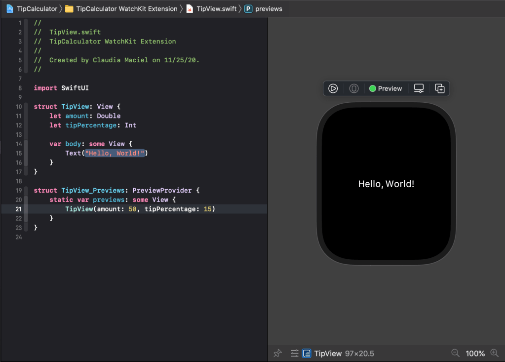
TipView(amount: 50, tipPercentage: 15) That will get rid of the error and we can now go back to our ContentView to show our new screen.
In our content view find our navigation link and change it to this:
NavigationLink(destination: TipView(amount: amount, tipPercentage: selectedPercentage)) {
   Text("Tip")
}
Now we can pass data between screens. Let’s go back to our TipView and show the users the data.
Let’s create a function that will do the work for us.
func calculateTip() -> String {
     let tipAmount = amount * (Double(tipPercentage) / 100.0)
     let tipAmountString = String(format: "%.2f", tipAmount)
     return "$\(tipAmountString)"
}
In this formula we calculate the tip Amount but we can’t multiply a Double with an Int so we convert our tipPecentage to a Double divide by 100 and multiply by the amount. We want our function to return a String so let’s format our number so it has 2 numbers after the decimal.
Finally we return the String with a dollar sign to it. This was the heart of this page all we have to do now is display it on our screen. I’m going to give you 3 minutes to try to do it on your own.
We might want to add some more items so let’s start with a VStack
Inside the VStack we will put our Text, but instead of doing an actual string we are going to call our function
It’s a bit small so let’s change the font size to 52. And as the last thing on this screen let’s add a title to the top.
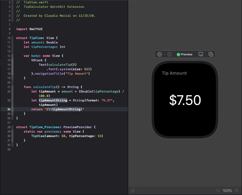
Go ahead and run it, it’s fully functional.
Using the Digital Crown
I like what we have but let’s integrate the use of the digital crown instead of the slider.
This will be done in our ContentView file so let’s go back.
Let’s delete the entire Slider, including the frame modifier.
We are instead going to add two new modifiers to our text view
Text("\(Int(amount))")
  .font(.system(size: 52))
  .frame(height: geo.size.height / 3)
  .focusable()
  .digitalCrownRotation($amount, from: 1, through: 500, by: 1, sensitivity: .high, isContinuous: false, isHapticFeedbackEnabled: true)
The focusable modifier tells watchOS that this text view can be focused, which means it’s in control of the events.
Once it’s focusable the digitalCrownRotation() does all the work. We give it the amount with two-way binding. And we can say it goes from 1 dollar to 200 dollars. It will step by 1 each rotation.
The sensitivity parameter controls how far the user needs to turn the crown in order to move the value. We want a high sensitivity since we have a lot of numbers to go through.
Continuous would go from 1 to 200 and once it reached 200 it would go back to 1 and we don’t want that.
We can run the app and we can scroll up and down on the dollar amount.
However we don’t get feedback as to it being active like we do with the tip percentage so let’s fix that now.
let’s add a new property
@State private var amountFocused = false
and then let’s change .focusable to
.focusable { amountFocused = $0 }
Let’s also add below digitalCrownRotation ()
.overlay(RoundedRectangle(cornerRadius: 10)
.strokeBorder(amountFocused ? Color.green : Color.white, lineWidth: 1))
This will create a view on top of the existing one, it will add a border and the color will depend on the amountFocused variable.
The size of our Text View leaves something to be desired so let’s make it larger.
find .frame(height and delete it.
let’s add
.padding()
.frame(width: geo.size.width)
This will give it some padding and make it stretch to the full width of the screen.
and finally let’s add some padding between the text and the HStack.
after the .overlay add
.padding(.bottom)
this way it will only add padding to the bottom.

Let’s run our app and make sure it all works, and looks good.
Notice that if we tap the picker then tap next to the label inside the border but not the text, nothing happens.
Let’s fix that. Before focusable() add
.contentShape(Rectangle())
I believe we are all done now.
